5 Tales of Car Brand Logos
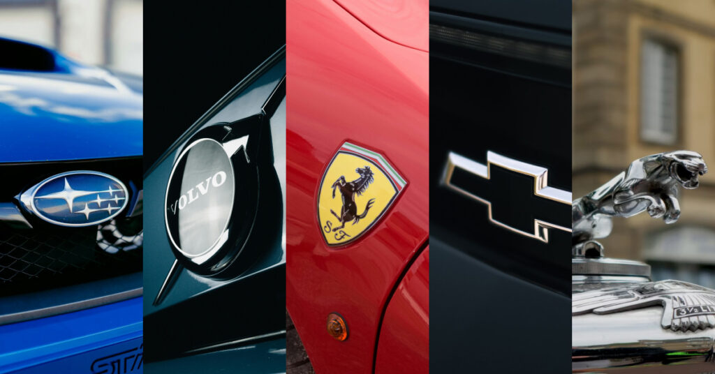
Have you ever looked at a BMW emblem and gone “why blue and white?” Or seen an animal on a car logo and wondered how they got there? We’re here to answer some of your questions. We’re tackling some of the most interesting stories of how cars got their logos. We’re gonna learn some history, a little bit of astronomy, and take a brief foray into the world of ancient alchemical symbols. Let’s find out how these car companies got their iconic symbols.
What’s the Story Behind Jaguar’s Biggest Branding Snafu?
Oh Jaguar, you had quite the 2024. The British car company got themselves a new font, made a commercial with no cars where hot people wandered around a soundstage designed to look like a desert and the internet was completely accepting and supportive about it. Just kidding! It was bad. At least Jaguar can take heart in the fact that it could be worse…so much worse. In fact, all they have to do is look into their own history. This is the tale of how Jaguar got its name and famous logo.
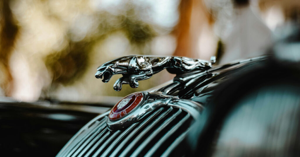
Jaguar began its journey as The Swallow Sidecar Company, founded in 1922 by William Lyons and William Walmsley in Blackpool, England. Swallow Sidecar was eventually liquidated when Walmsley wanted out and Lyons renamed his business SS Cars…in 1934. Do you see where this is going yet? SS Cars built some lovely, sleek vehicles including the SS Jaguar. All of these cars bore badges on them that read “SS” in big bold letters. And since they wanted a logo as stylish as their cars, the letters “SS” were cozily ensconced in the imagery of an eagle. It was whatever the opposite of serendipity is. For most of the war, everyone had much bigger things to worry about. But in 1945, SS Cars announced that its shareholders had agreed to change their name to Jaguar Cars Limited. William Lyons put it this way: “”Unlike S. S. the name Jaguar is distinctive and cannot be connected or confused with any similar foreign name.”
What Do the Six Stars of Subaru Represent?
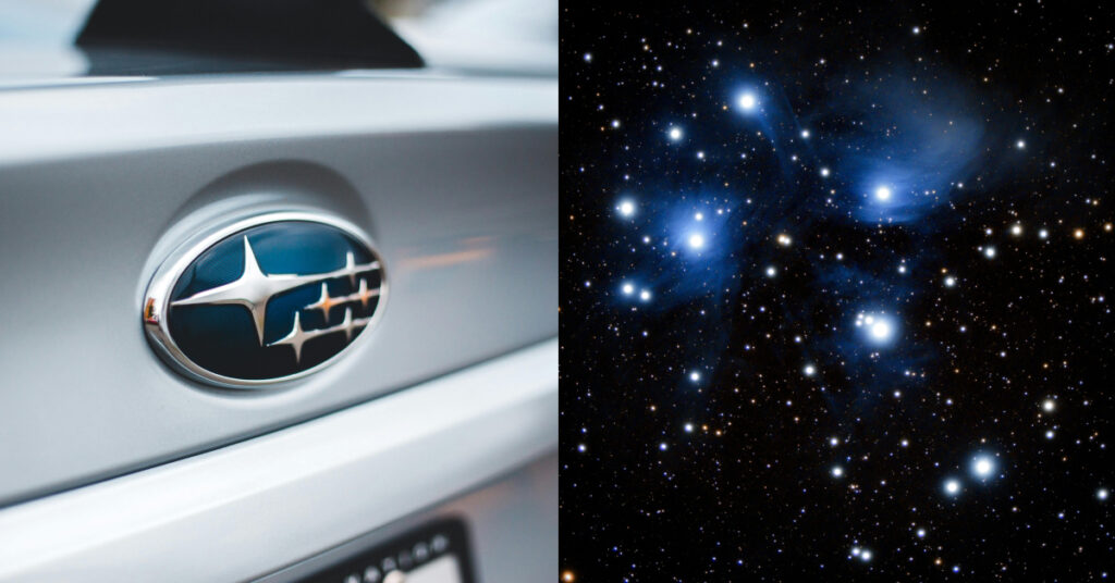
The stars are inspired by a cluster beloved all over the world. While their scientific name is Messier 45 and they’re colloquially known as the Seven Sisters, many cultures have their own name for them. In South Africa, it’s called IsiLimela. For the Māori, the stars are Matariki. The Greeks called them the The Pleiades. For the Japanese, they’re called Subaru (スバル). Subaru translates to “gathered together”. In the 1950s, Fuji Kogyo, Fuji Jidosha, Omiya Fuji Kogyo, Utsunomiya Sharyo, Tokyo Fuji Sangyo merged to create Fuji Heavy Industries which begat Subaru. It was perfect, six stars of a beloved cluster to represent those six companies. So it’s simple, the stars represent both the six companies that were Subaru’s ancestors and all six of the Seven Sisters.
Wait…
Wait wait wait.
I think we’re missing a star. Now that we think of it, there are only six stars visible from Earth when you look at that cluster. Let’s roll back a little bit and talk about Messier 45. Located in the Taurus constellation, this cluster is actually thousands of gorgeous stars that glow blue. We here on Earth only count the ones that we can see with the naked eye. If you have a good telescope and luck, you can spot nine or ten. So how did we end up with seven as a set number? All of those cultures I mentioned earlier and more include a seventh star in their myths about the culture. Ultimately, it comes down to the idea that they could see more stars when they looked up at the cluster. Theories as to why this is include stars becoming less bright after time or two stars moving so close together that they look like one. So when you look up into the sky…or on the front of a Subaru, think of the six or seven or nine or ten or one thousand stars of the Seven Sisters looking down at you.
Why are Porsche and Ferrari’s Logos So Similar?
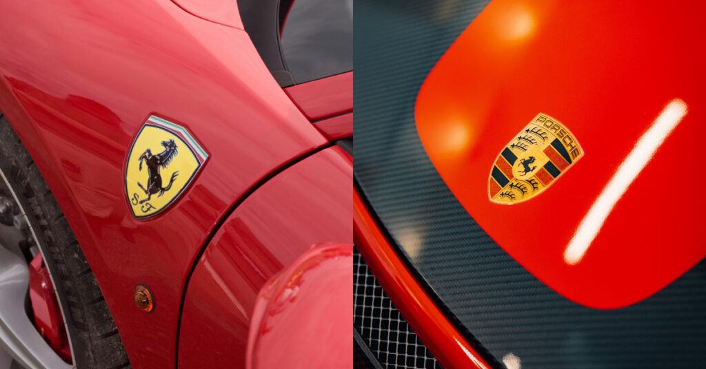
All the old European car companies love a badge with an animal or colors that represent whatever region they were founded in. Alfa Romeo has its Milanese cross and snake. BMW has the inverse Bavarian white and blue. The exception here is Lamborghini, who has a bull logo because Ferrucio Lamborghini was a Taurus who loved bullfighting. But for decades upon decades, people have noticed that Ferrari and Porsche’s logos seem related. Ferrari has a prancing black horse over a Modena yellow background. Porsche has a prancing black horse over the red and black of Württemberg-Hohenzollern quartered with antlers. The similarities even led to the formation of a truly plausible urban legend that explains the phenomenon. But we’re getting ahead of ourselves. Let’s back up all the way to World War I, where our story begins.
We start with Count Francesco Baracca, a WWI fighting ace with thirty four victories in the sky. One of the last things his enemies saw was Baracca’s emblem of a prancing black horse emblazoned on his plane. But skill can only take you so far. Baracca was shot down in 1918 and died at the age of 30. After his death, a great many things were named after him from roads to roller coasters. But it was an encounter between his parents and a young race car driver, Enzo Ferrari, that led to the most famous homage. After a suggestion from Baracca’s mother, Ferrari put a modified version of the black prancing horse on to his cars for luck. This later transferred over when Ferrari started building his own cars and the Cavallino Rampante became an iconic part of car history.
The Porsche/Ferrari urban legend hinges on one question: Why did Francesco Baracca put a horse on his plane? Some say it’s because he had been a cavalry officer and wanted to honor those roots/ Some say it’s because he was an equestrian. The most intriguing theory, however, is that he took the emblem from one of the German pilots that he killed. This alleged pilot hailed from Stuttgart, a city built to raise good horses. The downed pilot would have had a Stuttgart horse on his plane. Stuttgart is also the birthplace of Porsche AG, who took the Stuttgart horse as their logo. While this theory is just rumor and has no documentation to back it up, there’s something nice about the idea that these two horses we’ve been looking at for almost a century are actually the same horse.
Why does Volvo’s Logo Look Like the Symbol For Men?
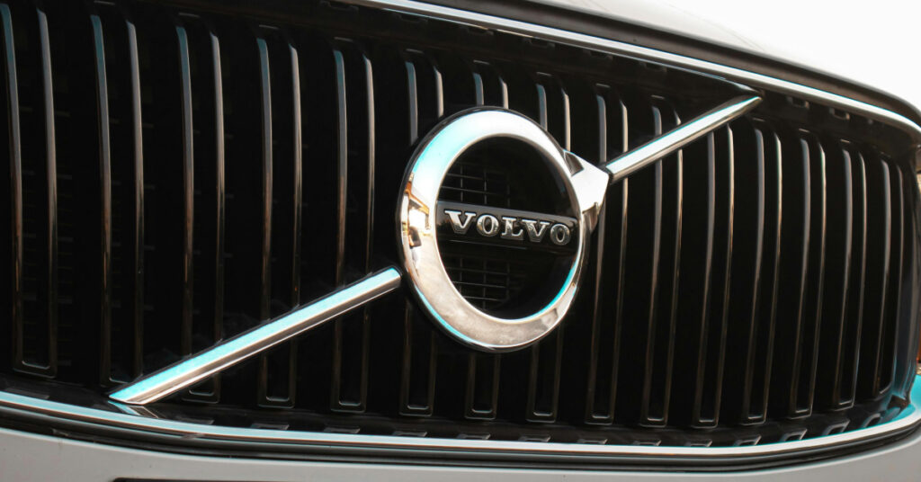
You could go your whole life without noticing that the circle in the Volvo logo is not a circle. From the badge on the car to the logo on the commercials, it’s there. That little arrow at the top of the circle that makes it something else. That circle with the arrow pointing out of it? Isn’t that the universal symbol for men? Why does Volvo have that as its logo? Yes. Technically that is the symbol for men. No, that’s not what it‘s supposed to represent but they share the same DNA. The Volvo logo harkens back to something much older: the alchemical symbol for iron.
For both its name and logo, Volvo chose to reach back into history. It got its name from a dead language. Volvo means “I roll” in Latin (It was not a reference to a car at all but to the ball bearings that were the company’s original purpose). But when it came to creating its logo, Volvo wished to honor its home country of Sweden. For a country famous for its iron mining, the ancient symbol for iron seemed just the thing. However, the alchemical classical metals are also the root of the gender symbols. The seven classic metals corresponded with planets. Iron (♂) corresponded with Mars, while Copper (♀) corresponded with Venus. In the 1700s, Carl Linneaus, marked “male” flowers with the symbol for Mars and “female” flowers with the symbol for Venus (hermaphroditic flowers were marked with “☿”, the symbol for Mercury). So there it is. Sweden wanted to celebrate their history of ironworking with a symbol that means a great deal…It’s worth noting that Sweden also mines copper.
Who Really Designed Chevrolet’s Iconic Bow Tie Logo?
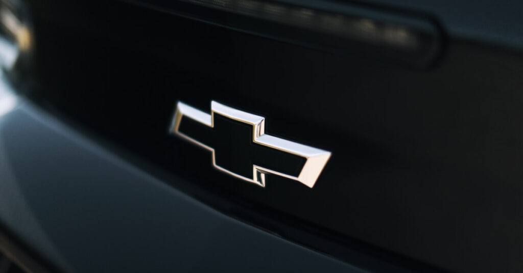
When you look at the famous bow tie on the Chevrolet logo, you think just one thing…that is a cross not a bow tie. But more seriously, that bowtie has been a symbol of strength and durability for more than a century. Its origins, however, are shrouded in mystery. Is it wallpaper? Is it the doodling of a child? Is it actually a cross after all? Let’s talk about the origins of the Chevrolet and its bow tie.
Chevrolet was created out of a moment of great turmoil. In 1908, William Durant founded General Motors. Under his tenure, GM possessed brands like Oldsmobile, Buick, Cadillac, and the Oakland Motor Car (which would later become Pontiac). But only two years later, shareholders spooked by the many acquisitions kicked Durant out of his own company. He responded by helping Louis Chevrolet, a Swiss race car driver and friend, create a new company. Chevrolet was so successful that Durant managed to regain control over GM by 1916.
With Louis Chevrolet being a native of Switzerland, it could be assumed that Chevy got its logo from the cross on the Swiss flag. After all, the first logo was just Louis Chevrolet’s signature. It stands to reason that its successor would also be a tribute to the man that gave the brand its name. It’s entirely possible but there are a surprising number of alternate theories as to what the logo is. The most widely accepted explanation is not the swiss cross, but wallpaper that Durant stole from a hotel in Paris. He thought it looked cool and made it the company logo. Another story suggests that one day, Durant looked down at the drawing his daughter was doodling on the kitchen table and turned it into the emblem. A more recent hypothesis noticed the resemblance between the bow tie and the logo of Coalettes, a product made by the Southern Compressed Coal Company. So many good backstory options to choose from. And hey, it’s only been a hundred years, there’s still time to find and create more theories.

 Cart
Cart
 Help Desk


